Pop-up banners have become indispensable marketing tools for businesses of all sizes, from small startups to established corporations. Whether you're promoting a new product, advertising an event, or building brand awareness at trade shows and exhibitions, a well-designed pop-up banner can make a significant impact on your target audience. The beauty of modern design technology is that creating professional, eye-catching banners is no longer exclusive to experienced graphic designers—anyone with the right tools and knowledge can produce compelling promotional materials.
This comprehensive guide walks you through everything you need to know about designing pop-up banners, covering industry-standard tools like Canva and Adobe Photoshop, technical specifications, design principles, keyword optimization for marketing, advanced design hacks, and common mistakes to avoid. By the end of this guide, you'll have the knowledge to create stunning pull-up banner stands and outdoor promotional displays that capture attention and drive results.
Understanding Pop-Up Banner Standards and Dimensions
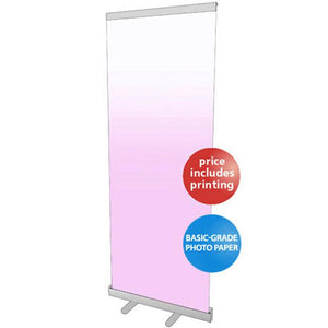
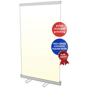
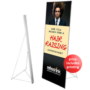
Before diving into design creation, understanding the technical specifications and standard dimensions of pop-up banners is critical to your success. Pop-up banners come in various formats, with the most common being X-banners (also called roll-up or pull-up banners) and retractable banners.
Standard Banner Sizes and Dimensions
The most popular pop-up banner dimensions include:
-
Standard Roll-Up Banner: 850mm x 2,000mm (33" x 80") - ideal for most events and trade shows
-
Budget Banner Options: 600mm, 800mm, 1,000mm, and 1,200mm width, all maintaining 2,000mm height
-
Premium Banner Sizes: 850mm x 2,150mm and 1,500mm x 2,150mm for premium displays
-
Wide Retractable Banners: Up to 1,500mm wide for maximum visibility and impact
-
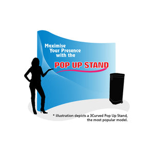
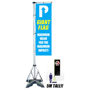
Extra Large Formats: 2,000mm to 3,000mm wide for major trade shows and exhibitions
Height remains relatively consistent at 2,000 to 2,150mm, as this is the optimal viewing distance for most audiences. When choosing your banner size, consider the viewing distance—banners viewed from 5-10 meters away need larger text and bolder visuals than those viewed from closer distances.
For Singapore businesses looking for affordable banner printing solutions, the Pull Up Stand Budget Series offers sizes ranging from 60cm to 120cm width, providing flexibility for different exhibition needs and budgets starting from SGD $95.
Important Zones and Safe Margins
Professional banner design incorporates specific zones to maximize visual impact:
-
Top Prime Zone (Upper Third): Your logo, primary headline, and key messaging should occupy this eye-level area where viewers naturally focus
-
Content Zone (Middle Section): Place supporting information, product benefits, and supporting visuals here
-
Action Zone (Lower Third): Reserve this space for your call-to-action buttons, contact details, and QR codes
-
Hidden Zone (Bottom 100-130mm): Avoid placing critical elements here, as this area gets cut or hidden by the cassette mechanism
Always maintain safe margins of at least 10mm from edges to prevent important content from being trimmed during the cutting process.
Technical Setup Before Design
Document Specifications for Print-Ready Banners
Success begins before you even start designing. Setting up your document correctly prevents costly mistakes and ensures professional print results.
For Photoshop:
-
Create a new document with dimensions matching your final banner size
-
Set resolution to 150-300 DPI for optimal print quality (120 DPI minimum for large-format printing)
-
Use CMYK color mode instead of RGB—this is crucial for accurate color representation when printed
-
Add a bleed area of 3-5mm on all sides to prevent white edges after trimming
-
Establish safe margins 6-10mm from the trim edge for critical content
For Canva:
-
Select "Custom Size" and enter your exact banner dimensions
-
Choose print-friendly templates that accommodate your content
-
Verify that your final export will be high enough resolution for printing
-
Download in PDF Print format rather than standard PDF for better color accuracy
Color Mode Deep Dive
The RGB vs. CMYK color mode distinction cannot be overstated. RGB (Red, Green, Blue) displays colors on screens by combining light. CMYK (Cyan, Magenta, Yellow, Black) is the printing industry standard using ink pigments. When you design in RGB and print in CMYK, color shifts occur—vibrant blues become duller, bright greens appear darker, and oranges can shift toward red. Always work in CMYK from the start to see exactly what your final print will look like.
Designing Pop-Up Banners with Canva
Canva has revolutionized graphic design accessibility, making professional-quality banner creation available to anyone, regardless of design experience. For comprehensive tutorials on getting started with Canva, visit the Canva Design School which offers free courses for beginners.
Step-by-Step Canva Banner Creation Process
Step 1: Set Up Your Design Space
Log into your Canva account and click "Create a design" followed by "Custom size." Enter your banner dimensions. If your banner is 3 meters x 1 meter, convert to pixels: 3,000cm x 100cm becomes approximately 3,000 x 1,000 pixels (using a scaling formula of cm x 37.795 for exact conversions, though Canva handles most conversions automatically).
Step 2: Choose Your Foundation
Browse Canva's extensive library of pre-made banner templates. Templates serve as excellent starting points because they already incorporate proven design principles—composition, hierarchy, spacing. You can then customize them with your specific content, saving considerable time.
Step 3: Customize with Brand Elements
Upload your logo through the "Uploads" section. Apply your brand colors using the Color Picker tool for consistency. Select brand-appropriate fonts from Canva's library or upload custom fonts to maintain visual identity.
Step 4: Add Impact with High-Quality Imagery
Incorporate stock photos from Canva's millions of options or upload your own images. Use high-resolution images (minimum 300 DPI equivalent resolution) to ensure sharp, professional results when printed at large sizes.
Step 5: Strategic Text Placement
Write compelling headlines using bold, readable fonts. Place text with sufficient contrast against the background. Use varying font sizes to create visual hierarchy—your main message should dominate, with supporting information smaller and less prominent.
Step 6: Finalize with CTA and Contact Details
Include a clear call-to-action such as "Call Today," "Visit Our Website," "Scan for Discount," or "Learn More." Add contact information, QR codes, or website URLs prominently in the lower third of the banner.
Advanced Canva Hacks for Professional Results
Brand Kit Mastery: Set up a Canva Brand Kit by uploading your logo, entering exact hex color codes for your brand colors, and selecting your preferred fonts. Once established, these elements appear instantly in every design, ensuring consistency and dramatically reducing design time.
Bulk Create Feature: If you need multiple similar banners (different messages, dates, or variations), use Canva's Bulk Create feature. Create a spreadsheet with your text variations, upload it, link it to your design elements, and Canva generates multiple unique graphics simultaneously—a true time-saver for repetitive projects.
Magic Switch for Multiple Formats: Design once, adapt everywhere. Canva's Magic Switch automatically resizes your banner for different formats—social media, email headers, printed materials. While minor adjustments usually follow, this feature eliminates redesigning from scratch.
Element Library Organization: Create personal folders for frequently used graphic elements, icons, and photos. Right-click any element and add it to a dedicated folder. Having a searchable personal library of brand-consistent assets dramatically speeds up future projects.
Copy and Paste Between Designs: Use standard keyboard shortcuts (Ctrl+C / Cmd+C to copy, Ctrl+V / Cmd+V to paste) to replicate complex elements, text layouts, or button designs across different projects. This prevents repetitive work and maintains design consistency.
Text Background for Readability: When text must sit on busy or photographic backgrounds, use Canva's Effects > Background feature. Add a semi-transparent background behind your text with adjustable opacity and rounded corners, ensuring perfect readability even on complex backgrounds.
Alignment Tools and Grids: Access alignment tools through the Position menu to perfectly center and arrange elements. Enable Shift+R to show rulers and drag guides onto your canvas for pixel-perfect alignment. Pre-made grids under Elements help structure content into organized, professional-looking layouts.
Lock Important Elements: Once you've positioned your logo or background image perfectly, right-click and select Lock to prevent accidental movement while editing other design components. This sanity-saving feature prevents frustrating repositioning.
Exporting Banners from Canva for Print
The export stage determines your final quality, making it critically important.
Click "Download" in the top-right corner. Select "PDF Print" rather than standard PDF—this format maintains color accuracy and prevents quality degradation. PDF Print uses vector-compatible formats that printers can scale without losing quality.
For large-format printing (banners larger than 1 meter), you have options: download as PDF Print, then open in Photoshop to convert to TIFF with 150 DPI resolution, or download as high-resolution PNG/JPEG if your printer requests these formats. Always confirm your printer's preferred format and color profile before downloading.
Professional Banner Design with Adobe Photoshop
Adobe Photoshop offers unparalleled control for designers creating complex, highly customized banner designs requiring advanced techniques and precise editing. For beginners wanting to learn Photoshop fundamentals, Adobe's official Photoshop tutorials provide step-by-step guidance on design basics.
Setting Up Your Photoshop Document Correctly
Launch Photoshop and access File > New or press Ctrl+N. The document setup dialog appears. For a 60cm x 160cm banner intended for printing:
Enter dimensions in your preferred units (inches, centimeters, pixels). Set width to 600mm and height to 1600mm, then add bleed: 620mm x 1620mm to accommodate the extra cutting margin.
Select resolution based on banner size and viewing distance. For large banners viewed from 5+ meters away, 120-150 DPI suffices. For smaller banners or closer viewing distances, use 200-300 DPI. Remember: file sizes increase exponentially with resolution, so choose the minimum required for quality.
Select CMYK Color Mode—this is non-negotiable for print projects. Photoshop will show you colors as they'll appear when printed, not as vibrant RGB screen colors.
Set the color depth to 8-bit per channel (the standard for printing), and choose your color profile based on your printer's specifications (often your printer provides a color profile to download).
Creating Dynamic Backgrounds
Gradient Backgrounds for Visual Impact:
Select the Gradient Tool (press G). In the tool options, choose a gradient style—Linear, Radial, Angle, Reflected, or Diamond. Create custom gradients using the Gradient Editor (double-click a gradient swatch). Drag across your canvas to apply the gradient. Experiment with blending modes like "Overlay," "Soft Light," or "Multiply" to create sophisticated, layered background effects.
Advanced Technique: Apply a gradient, then create a duplicate layer with a different gradient. Change the blending mode of the top layer to "Difference" or "Lighten Only" to create unique, multi-toned backgrounds. Use Layer > Layer Mask > Reveal All, then paint on the mask with black to blend gradients smoothly.
Layered Color Combinations:
Create multiple layers with different solid colors. Use Gaussian Blur (Filter > Blur > Gaussian Blur) to blur and blend them together. Adjust opacity and blending modes to create sophisticated, multi-colored backgrounds with seamless transitions. This approach offers more control than automatic gradients.
Text Integration and Typography
Press T to activate the Type Tool. Click on your canvas where you want text to appear. Type your headline or message. Format your text through the Character and Paragraph panels.
For maximum readability from distance:
-
Headline text: 60-100pt or larger, depending on banner size and viewing distance
-
Body text: 24-36pt for supporting information
-
Fine print: 12-18pt for contact details or disclaimers
Choose typefaces strategically. Sans-serif fonts like Helvetica, Arial, or modern alternatives like Montserrat work excellently for banners—they're clean, bold, and highly readable from distance. Limit yourself to maximum two font families per banner for professional coherence. Mixing more than two fonts creates visual chaos that dilutes your message.
Ensure sufficient color contrast between text and background. Black or dark gray text requires a light background; white or light text needs a dark background. Test readability by stepping back from your monitor or reducing zoom to 50% to simulate distance viewing.
Advanced Layer Styles for Professional Effects
Access Layer Style options by right-clicking any layer. Add effects that enhance text and design elements:
Drop Shadow: Creates depth by appearing to lift text above the background. Adjust Distance (3-10px), Blur (5-15px), and Opacity (60-100%). A subtle shadow looks professional; an exaggerated shadow appears amateur.
Stroke/Outline: Add a colored border around text or shapes. This is especially effective for white text on bright backgrounds—a thin dark stroke makes white text readable against any background.
Gradient Overlay: Apply gradient color to layers for sophisticated effects. This is particularly striking on text layers, creating eye-catching color transitions.
Outer Glow: Gives the appearance of light radiating from an element. Use sparingly and with low opacity (20-50%) for subtle enhancement rather than dramatic effect.
Bevel and Emboss: Creates 3D-like depth. Keep the effect subtle to maintain professionalism.
Access these effects strategically—multiple effects on a single layer can look overdone. Generally, one or two complementary effects per major element provides the best result.
Creating 3D Pop-Out Effects
The 3D pop-out effect makes elements appear to leap from the banner surface, creating dramatic visual interest.
Select your main object using the Free Select or Magic Wand tool. Press Ctrl+J to duplicate this selection into a new layer. Create several duplicates—you'll use these for shadow and depth effects.
On duplicate layers, apply effects to create the illusion of depth:
-
On the bottom layer, apply significant blur (Filter > Blur > Motion Blur with distance 15-30 pixels at a slight angle)
-
Reduce opacity to 30-50% to create a shadow effect
-
Slightly offset this layer down and to the side
-
Apply the same process to middle layers with progressively less blur
-
Keep your main object layer on top, unmodified
Add supporting elements like light rays, particle effects, or geometric shapes to enhance the 3D impression. The combination of multiple shadow layers creates convincing depth that makes elements appear three-dimensional.
Image Adjustment for Print Quality
Before considering your design complete, adjust all images for optimal print reproduction.
Use Image > Mode to verify CMYK color mode. Run Image > Adjustments > Color Balance to fine-tune color tone. Move sliders slightly toward Cyan and Black to increase richness and reduce that washed-out appearance that sometimes occurs in printing.
Sharpen images with Filter > Sharpen > Unsharp Mask (Amount: 100-150%, Radius: 0.5-1.0 pixels, Threshold: 0) to ensure images remain crisp when printed. Print tests often reveal that images soften slightly during the printing process, so deliberate sharpening compensates.
Adjust contrast with Image > Adjustments > Brightness/Contrast or use Curves (Ctrl+M) for more precise control. Increased contrast helps images pop and ensures dark areas remain truly dark rather than muddy.
Font Management and Rasterization
If your banner design will be sent to print vendors, avoid potential font substitution issues by rasterizing text layers. Text in Photoshop remains editable but requires that recipients have the exact fonts installed. Rasterizing converts text to pixels, fixing the appearance permanently.
Before rasterizing, duplicate your text layers for archival purposes (save this as a separate PSD file with editable layers). Then right-click the text layer and select "Rasterize Type" to convert it to pixels.
Alternatively, flatten your document (Image > Flatten Image) only after you've finalized every detail and confirmed no further edits are needed. Flattening combines all layers into a single layer, making the file ready for export.
Photoshop Export and File Saving
After finalizing your design, save in multiple formats for safety and flexibility.
Save Original: File > Save As and save as PSD (Photoshop's native format). This preserves all layers, adjustment layers, and edit history. Name it descriptively: "Banner_300x100cm_Final_Editable.psd"
Export for Print: File > Export As and choose TIFF format. TIFF uses lossless compression, meaning no quality loss. Configure settings: LZW compression (Layer compression) and ZIP compression (Image compression). TIFF files can be extremely large but guarantee quality.
Alternative Export: If your printer requests JPEG, export File > Export As > JPEG with quality set to maximum (12 on a 1-12 scale). Accept that JPEG is lossy compression—quality degrades slightly—but it's acceptable for large-format printing viewed from distance.
Always name your exported files clearly: "Banner_300x100cm_RollUp_CMYK_300DPI_Final.tif"—include dimensions, color mode, resolution, and format for clarity during vendor communication.
Banner Design with CorelDRAW
CorelDRAW excels at creating vector-based designs and is particularly popular among print professionals in Southeast Asia and beyond.
CorelDRAW Document Setup and Background Creation
Launch CorelDRAW and create a new document. Set your page size to match your banner dimensions (File > Document Properties). Set to 60cm x 160cm for your example X-banner.
Create your background using the Rectangle Tool. Click-drag to fill your entire workspace. The rectangle becomes your background canvas.
Apply color fill by right-clicking the rectangle. Select "Fill" and choose your color. For gradient backgrounds, click "Fill" again and select "Fountain Fill Type" to access gradient options. Choose gradient style (Linear, Radial, Conical, Square), adjust angle to 90 degrees or your preferred angle, and select color transitions.
CorelDRAW provides excellent gradient control—select specific colors at different points, reverse gradients, or create custom multi-color transitions. Layer multiple rectangles with different fills, transparency, and blending modes for sophisticated backgrounds.
Advanced Vector Techniques in CorelDRAW
The Ellipse Tool and Shape Tools allow creation of geometric design elements. Create circles, squares, and complex shapes to add visual interest without looking amateur.
Select the Transparency Tool (keyboard shortcut) and adjust transparency to 30-70% to create layered effects where shapes interact visually. Use the Blending Tool to create smooth color transitions between two objects.
Text in CorelDRAW: Select the Text Tool, click your design, and type. Choose fonts that are bold and highly readable. Apply effects through Object > Powerclips to create text following paths (curves) or Object > Effects > Contour to add outlined, shadow, or dimensional effects.
For text on paths (making text follow a curved line, for example), use the Pen Tool to create your desired path, then click text and click the path to attach it.
Exporting from CorelDRAW for Print
File > Export launches the export dialog. Choose TIFF as your export format for print reliability. Set resolution to 300 DPI at full size. Select "Use Artboard" to ensure export dimensions match your document size.
JPEG export is possible but inferior to TIFF. Set JPEG quality to maximum if required. Export as EPS (Encapsulated PostScript) if your printer specifically requests this format—EPS preserves vector information and is highly compatible with professional printers.
Always test exports with a small preview or request a physical proof from your printer before committing to a full print run.
Alternative Design Tools for Banner Creation
Beyond Canva and Photoshop, several tools serve specific banner design needs.
Adobe Illustrator specializes in vector graphics, making it ideal for banners with logos, illustrations, and text-heavy designs. It integrates seamlessly with other Adobe Creative Cloud applications and maintains precise vector scaling without quality loss.
Affinity Designer offers a lower-cost alternative to Illustrator with similar vector capabilities. It's a one-time purchase rather than subscription-based and has gained significant popularity among freelance designers.
Snappa rivals Canva with similar ease of use and extensive template libraries, offering different aesthetic styles and specialty templates for various industries.
Adobe Express provides free templates with AI-powered design suggestions, perfect for quick banner creation within the Adobe ecosystem.
Photopea is a web-based Photoshop alternative offering most Photoshop features in a browser without expensive software subscriptions. For additional free design resources, explore PixelBuddha which provides mockups, icons, and templates for commercial use.
Essential Pop-Up Banner Design Elements
Every effective banner incorporates specific elements strategically arranged to maximize impact and communication. For detailed insights on creating impactful designs, read the comprehensive guide on crafting pull-up banner designs.
The Visual Hierarchy Framework
Human eyes don't read web pages or banners sequentially—they scan quickly following natural patterns (F-pattern or Z-pattern). Designers must place critical information along these natural viewing paths.
Logo: Position at top-center or top-left. Your logo immediately identifies your brand and builds recognition. Make it prominent enough to identify from 5+ meters away but not so large that it overwhelms other elements.
Primary Headline: This is your single most important message. Use 60-100pt font in bold, contrasting color. Viewers should understand your core message within 3 seconds of seeing the banner. Examples of strong headlines: "50% Discount Today Only," "Join 10,000+ Happy Customers," "Limited Time Offer—Register Now."
Supporting Image or Illustration: High-quality visuals communicate faster than text. Use professional product photography, lifestyle images showing your product in use, or custom illustrations reinforcing your brand personality. Ensure images are at least 300 DPI resolution.
Supporting Text and Key Points: Use 24-36pt font for 3-5 bullet points highlighting specific benefits. Avoid long paragraphs—viewers won't read dense text on a banner. Example: Instead of "Our advanced technology ensures efficient operations," write "Saves 40% Operating Costs."
Call-to-Action (CTA): Your final ask must be unmistakably clear. Use action verbs: "Call Now," "Visit Our Store," "Scan for 20% Off," "Register Today," "Learn More." Place this in the lower third, eye-level or slightly below to guide viewers toward the next step.
Contact Information or QR Code: Include phone number, website URL, email, and business hours. Position a QR code at waist to chest height, large enough to scan comfortably without bending (minimum 2cm x 2cm). Include small text like "Scan for Exclusive Offers" above or below the code.
Color Psychology in Banner Design
Colors trigger subconscious emotional and psychological responses. Strategic color selection dramatically impacts viewer engagement and conversion:
-
Red: Creates urgency, excitement, and energy. Ideal for limited-time offers, sales, and calls-to-action
-
Blue: Conveys trust, professionalism, and calm. Perfect for corporate services, financial institutions, and B2B companies
-
Green: Represents growth, health, and sustainability. Excellent for eco-friendly products and wellness services
-
Yellow: Attracts attention and conveys optimism. Effective for attention-grabbing banners and youth-oriented brands
-
Purple: Suggests luxury, creativity, and sophistication. Ideal for premium services and creative industries
-
Orange: Combines red's energy with yellow's friendliness. Great for entertainment, food, and casual businesses
-
Black: Projects sophistication and authority. Use as background for high-contrast text and professional industries
Create color contrast with high contrast between text and background (minimum 4.5:1 ratio for accessibility compliance). Light text on dark backgrounds and vice versa ensures readability from distance.
Typography for Distance Viewing
Typeface selection determines whether viewers can read your message from 5 meters away or whether it becomes an unreadable blur.
Best Practices:
-
Use sans-serif fonts (Helvetica, Arial, Montserrat, Open Sans) for maximum clarity
-
Maintain font weight at bold or semi-bold for strength and visibility
-
Limit to maximum 2-3 typefaces per design for consistency
-
Use font size hierarchy: headline (60-100pt) > body text (24-36pt) > fine print (12-18pt)
-
Test readability by stepping back or viewing at 50% zoom to simulate distance viewing
Avoid decorative fonts, script fonts, or highly stylized typefaces that sacrifice readability for aesthetics. Your message must be understood instantly.
Strategic White Space
White space (negative space, or "breathing room") between elements isn't wasted space—it's a design tool that directs attention and improves comprehension.
Cluster related information together. Separate different message blocks with significant spacing. Use white space to create visual flow that guides the viewer's eye through your design in the intended order: logo → headline → image → supporting points → call-to-action.
Designs that appear too crowded overwhelm viewers and reduce message retention. Professional designers embrace simplicity and spacing.
Banner Design Keywords and SEO Optimization
If your banner includes web URLs or QR codes, optimize keyword targeting for search engine visibility.
Target Keywords for Banner Marketing Campaigns
Research keywords your target audience searches when looking for your product or service. Understanding keyword targeting helps ensure your promotional materials resonate with search intent.
General Banner Keywords:
-
"Custom banners"
-
"Banner printing"
-
"Roll-up banners"
-
"Trade show banners"
-
"Event banners"
Specific Type Keywords:
-
"Vinyl banners"
-
"Retractable banners"
-
"X-banners"
-
"Double-sided banners"
-
"Large format banners"
Size-Specific Keywords:
-
"3x8 banners"
-
"6x10 banners"
-
"Custom size banners"
Use-Case Keywords:
-
"Trade show banners"
-
"Outdoor banners"
-
"Indoor banners"
-
"Conference banners"
-
"Exhibition banners"
Incorporate 2-3 primary keywords naturally in your banner's text. If designing a real estate banner, include keywords like "property marketing banners" or "real estate event banners" in your headline or supporting text. This helps viewers searching those terms discover your business.
Image Optimization for Web:
If banner images appear online (website, social media), optimize the image file name and alt text. Instead of "Banner_Final.jpg," use "Custom_Corporate_Banners_600x200cm_Vinyl.jpg." For alt text, write descriptive alternatives like "Custom vinyl banners for corporate trade shows - 600cm x 200cm roll-up banner design."
Advanced Design Hacks and Professional Tips
The 30-Second Rule
Design banners assuming viewers have only 30 seconds of attention. Your message must be understood instantly. If someone reads your banner for longer than this, you've either engaged them or provided too much information. Err on the side of simplicity.
Color Contrast Testing
Use online contrast checkers to verify that text meets WCAG accessibility standards (minimum 4.5:1 for normal text, 3:1 for large text). Higher contrast ensures visibility for both fully sighted viewers and those with color vision deficiency.
The Mockup Advantage
Before committing to print, visualize your design in realistic contexts using mockup generators. Canva and specialized mockup tools offer hundreds of banner mockup templates showing your design displayed on actual streets, in office spaces, at trade shows, etc. This reveals issues invisible in flat design views—text might be too small from distance, colors might clash with expected backgrounds, or layout might feel unbalanced in 3D space.
Batch Production Strategies
If creating multiple similar banners (different dates, locations, or messages), use Canva's Bulk Create feature or create a Photoshop template with editable text layers and replace-able image layers. This standardizes design while enabling variation, dramatically reducing per-banner design time.
QR Code Optimization
QR codes should link to mobile-optimized landing pages (not desktop versions) that load within 3 seconds. Include a clear call-to-action above or below the code: "Scan to Save 20%" or "Scan for Event Details." Make QR codes at least 2cm x 2cm, positioned at comfortable scanning height (chest level, 1-1.5 meters from ground).
A/B Testing Your Banner Design
If possible, create two design variations with different headlines, colors, or calls-to-action. Display both at different locations or during different time periods. Track engagement (inquiries, QR scans, foot traffic, conversion rates) to determine which resonates better with your audience. Use this data for future banner iterations.
For businesses implementing banner marketing strategies, explore the comprehensive banner marketing guide to understand how to boost sales through effective display solutions.
Critical Design Mistakes to Avoid
Mistake 1: Low Image Resolution
The most devastating error is using low-resolution images. Images that appear sharp on-screen at 72 DPI become pixelated and blurry when enlarged to banner size.
Solution: Always source images at minimum 150-300 DPI at final print size. When in doubt, use higher resolution—it's better to downscale a high-resolution image than upscale a low-resolution one (upscaling only multiplies existing pixelation).
Mistake 2: Incorrect Color Mode
Designing in RGB instead of CMYK results in printed colors that don't match your screen preview. Bright, vibrant RGB colors become muted in CMYK printing.
Solution: Switch to CMYK mode immediately when starting your design. If you've already designed in RGB, Image > Mode > CMYK in Photoshop to convert. Note: this conversion will shift colors, so adjust your design accordingly.
Mistake 3: Neglecting Bleed and Safe Margins
Designers who ignore bleed areas often find critical content cut off during trimming. Banners get trimmed, hemmed, and eyelets added—elements too close to edges disappear.
Solution: Add 3-5mm bleed on all sides and keep critical content 6-10mm from trim edges. Most design software shows bleed areas visually, helping you position elements correctly.
Mistake 4: Overcrowded Design
Too much text, too many colors, too many design elements create cognitive overload. Viewers can't focus on your message and abandon the banner.
Solution: Implement the "less is more" philosophy. Use 3-5 bullet points maximum, two primary colors with accent color(s), and embrace white space. Test readability and comprehension by showing designs to fresh eyes—they'll quickly identify if information overload exists.
Mistake 5: Poor Typography Choices
Decorative fonts, small text sizes, or low contrast between text and background render banners unreadable from distance.
Solution: Choose bold, sans-serif fonts, use 60pt+ for headlines, maintain high color contrast, and test readability at distance or reduced zoom levels. When in doubt, "boring" professional fonts work better than stylized alternatives.
Mistake 6: Weak Call-to-Action
Vague CTAs like "Click Here" or no CTA at all leave viewers uncertain what action you want.
Solution: Use specific, action-oriented language. "Call 555-0123 Now," "Visit UsToday.com," "Reserve Your Spot," or "Scan for 30% Discount" tells viewers exactly what to do next.
Mistake 7: Inconsistent Branding
Banners that don't reflect your established brand identity confuse audiences and dilute brand recognition.
Solution: Use your official brand colors, logo, and fonts. Apply the same design language and tone used in your other marketing materials. Consistency builds trust and aids brand recall.
Technical Specifications Summary
Resolution Requirements by Banner Type
-
Indoor banners viewed <3 meters: 300 DPI
-
Indoor banners viewed 3-10 meters: 200-250 DPI
-
Outdoor banners viewed 5-10 meters: 150-200 DPI
-
Large outdoor banners viewed 10+ meters: 100-150 DPI
Color Mode Requirements
-
All print banners: CMYK color mode
-
Never: Design in RGB expecting print accuracy
File Format Recommendations
-
Best for print: TIFF with LZW/ZIP compression
-
Alternative for print: PDF Print format
-
Acceptable if requested: High-quality JPEG (quality 9-12)
-
Not recommended: PNG (causes color shifts), GIF (limited colors)
Export Settings Best Practices
-
Flatten layers after finalizing all edits
-
Embed all fonts or rasterize text to avoid substitution issues
-
Include bleed in final export dimensions
-
Name files descriptively: "Banner_300x100cm_RollUp_CMYK_150DPI_Final.tif"
Designing for Different Banner Types
Roll-Up Banner (Pull-Up Banner) Design
Roll-up banners stand vertically, usually 80-215cm tall and 60-200cm wide. Design vertically—arrange elements top-to-bottom assuming viewers read downward. Place logo at top, headline below, supporting visuals in middle, and call-to-action near bottom.
For professional insights into modern banner design trends and best practices, the 2025 banner design guide provides comprehensive coverage of layout architecture, color psychology, and exhibition-optimized designs.
Horizontal Banner Design
Horizontal banners follow left-to-right reading patterns. Place logo on left, headline spanning center, supporting visuals right-center, and call-to-action on right. Use horizontal imagery that fits the wide format without distortion.
Outdoor Banner Specifications
Outdoor banners face weather, sunlight fading, and viewing from greater distances. Use UV-resistant inks and materials. Increase color contrast and font sizes compared to indoor banners. Avoid neon shades that rarely print accurately. Consider that sunlight may create glare or color shift on glossy finishes—matte finishes usually perform better outdoors.
For durable outdoor advertising solutions, custom outdoor PVC banners provide weather-resistant materials with vivid color quality that withstands Singapore's tropical climate.
Professional Printing Considerations
Choosing the Right Material
Different banner applications require specific materials:
PVC Vinyl: Durable, weather-resistant, ideal for outdoor use. PVC banners offer excellent resistance to fading, tearing, and moisture damage.
Fabric Banners: Elegant appearance for indoor displays, trade show backdrops, and upscale events. Wrinkle-resistant and lightweight.
Synthetic Paper: Tear-proof material perfect for retractable banners. Provides matte finish that eliminates glare under exhibition lighting.
Mesh Banners: Specially designed for windy conditions. Perforated material allows wind to pass through, preventing banner damage.
Working with Professional Printers
When sending your design to print vendors:
-
Provide Specifications: Clearly communicate final dimensions, material preferences, and finishing requirements (hemming, eyelets, grommets)
-
Request Proofs: Always review digital or physical proofs before full production
-
Verify Color Profiles: Confirm printer's color profile and provide your design in matching format
-
Discuss Timeline: Account for design approval, printing time, and shipping when planning campaign launches
-
Order Samples: For large orders, request a single sample print to verify quality before committing to full production
For Singapore businesses seeking fast turnaround times, PVC banner printing services deliver custom-sized banners in 3-5 business days with vivid print quality and weather-resistant properties.
Banner Design Trends for Modern Marketing
Minimalist Design Philosophy
Contemporary banner design embraces minimalism—using extensive white space, single powerful images, and concise messaging. This approach creates immediate visual impact and ensures message comprehension within the critical 3-second viewing window.
Interactive Elements and QR Integration
Modern banners bridge physical and digital marketing through strategic QR code placement. Link QR codes to:
-
Exclusive discount landing pages
-
Product demonstration videos
-
Event registration forms
-
Social media profiles
-
Interactive catalogs
Geometric Patterns and Modern Aesthetics
Geometric shapes create visual interest without overwhelming viewers. Circles convey unity and completeness, hexagons suggest innovation and connectivity, triangles imply direction and movement. Layer these shapes with appropriate transparency to create depth.
Photography-Centered Designs
High-quality lifestyle photography showing products in real-world contexts resonates more effectively than stock imagery. Authentic photography builds trust and helps viewers visualize themselves using your product or service.
For restaurant and cafe businesses, explore specialized promotional banner solutions designed specifically for food service marketing with appetite-appealing designs.
Comprehensive Exhibition Design Strategy
Planning Multi-Banner Displays
When designing for trade shows and exhibitions, create cohesive visual systems:
Modular Content System: Design flexible panels that work independently or combine into unified displays. Develop master templates with interchangeable elements for different booth sizes.
Brand Consistency Across All Touch Points: Ensure all banners, business cards, brochures, and digital materials share visual language—colors, fonts, imagery style.
Strategic Placement Planning: Position your most important banner at eye level directly facing main traffic flow. Use smaller banners as supporting elements guiding visitors deeper into your booth.
For comprehensive exhibition design strategies covering pull-up banners, pop-up displays, and professional graphics, the exhibition design guide reveals exactly how to design displays that attract visitors and convert them into customers.
Budget-Conscious Banner Solutions
Maximizing ROI on Banner Investments
Quality banners represent significant marketing investments. Maximize return through:
Reusable Design Elements: Create banners with evergreen messaging rather than date-specific promotions. A banner promoting "Free Consultation" remains relevant indefinitely, while "50% Off January Sale" expires quickly.
Modular Messaging Panels: Design base banners with permanent branding, supplemented by smaller, easily replaceable panels for timely promotions.
Proper Storage and Maintenance: Store banners rolled (not folded) in protective cases. Clean gently with damp cloth. Proper care extends lifespan significantly.
Multi-Purpose Applications: Design banners suitable for multiple venues—trade shows, retail displays, conference backdrops. Versatility increases usage frequency and value.
For budget-conscious businesses, the Budget Series pull-up banners start from SGD $95 and include tear-proof synthetic materials with aircraft-grade aluminum construction supporting 50-100 setup cycles.
Environmental Considerations in Banner Design
Sustainable Printing Practices
Modern businesses increasingly prioritize environmental responsibility:
Eco-Friendly Materials: Choose recyclable vinyl or biodegradable fabric options. Many suppliers now offer PVC-free alternatives with comparable durability.
Vegetable-Based Inks: Request printers using soy or vegetable-based inks rather than petroleum-based alternatives. These inks produce comparable quality with reduced environmental impact.
Longevity Focus: Design timeless banners that remain relevant for years rather than trendy designs requiring frequent replacement. Higher initial quality investment reduces long-term waste.
Recycling Programs: Work with printers offering banner recycling programs. Old banners can be repurposed into bags, tarps, or other products.
Final Recommendations and Best Practices
Pre-Print Checklist
Before sending your design to print:
-
Verify document is in CMYK color mode
-
Check resolution (minimum 120 DPI for large format, 150+ for smaller)
-
Confirm all fonts are embedded or text is rasterized
-
Verify bleed and safe margins are correct
-
Check all text for spelling and accuracy
-
Test all links and QR codes
-
Request and review printer's digital proof
-
Verify color profile matches your printer's specifications
-
Confirm file naming and organization with printer
Printer Communication
Provide printers with clear specifications:
-
Final banner dimensions and quantity
-
Desired material (vinyl, fabric, paper, canvas)
-
Required finishing (hemming, eyelets, handles)
-
Color profile or reference color matching standard
-
Deadline and rush fees if applicable
-
Any special requirements (double-sided, folding, etc.)
For businesses seeking reliable printing partners in Singapore, professional banner printing services offer extensive ranges including pull-up retractable banners, PVC banners for outdoor use, pop-up display solutions, and custom-sized designs with 3-5 day production timelines.
Continuous Improvement Through Testing
Banner marketing succeeds through iterative refinement:
Track Performance Metrics: Monitor foot traffic, inquiries generated, QR code scans, and conversion rates attributable to banner campaigns.
Gather Feedback: Ask customers how they discovered your business. Document banner effectiveness across different locations and events.
Iterate Designs: Use performance data to refine future banner designs. Test different headlines, images, and layouts systematically.
Build Template Library: Archive successful designs as templates for future projects. Document what worked and why for institutional knowledge.
For comprehensive buying guidance covering budget, premium, and deluxe banner options with detailed quality comparisons, the pull-up banner buying guide provides expert recommendations for Singapore businesses across all price ranges.
Conclusion
Creating professional pop-up banners combines technical knowledge, design principles, and strategic thinking. Whether using Canva's accessibility and speed, Photoshop's advanced control, or CorelDRAW's vector excellence, the fundamental principles remain constant: understand your audience, communicate a single clear message, use strategic colors and typography, and optimize every technical specification for print success.
By following this comprehensive guide, avoiding common mistakes, and implementing professional design practices, you'll create banners that capture attention, communicate effectively, and drive meaningful results for your business. Success comes not from complexity but from clarity, simplicity, and attention to technical detail.
Your banners are mobile billboards for your brand—invest in their quality, and they'll reward you with engagement, inquiries, and conversions far exceeding their modest cost. With the right design approach, quality materials from reliable suppliers like Pullupstand.com, and strategic deployment, your pop-up banners become powerful marketing assets that elevate brand presence and drive business growth.
Remember: effective banner design isn't about following every trend or incorporating every design technique—it's about understanding your audience's needs, crafting messages that resonate, and presenting information in visually compelling ways that inspire action. Start with solid fundamentals, test your designs in real-world contexts, learn from results, and continuously refine your approach. The investment in mastering banner design pays dividends through increased brand visibility, customer engagement, and ultimately, business success.


