Creating high-performing banners requires strategic planning, professional design principles, and technical precision. This guide covers everything you need to design banners that capture attention and drive results.
1. Planning Your Banner Strategy
Define Clear Objectives
Before designing, establish your goal:
- Drive event/booth traffic
- Promote sales or limited offers
- Build brand awareness
- Generate leads or conversions
- Showcase products or services
Match Format to Environment
| Display Type | Best Use | Viewing Time | Recommended Product |
|---|---|---|---|
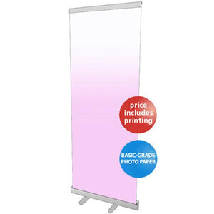
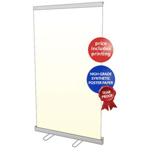
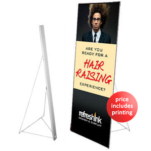
| Trade Show/Events | Booth displays, presentations | 5-15 seconds | Retractable banner stands |
| Point-of-Sale | Counters, reception desks | 3-10 seconds | Tabletop displays |
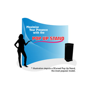
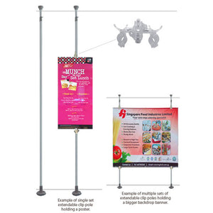
| Photo Backdrops | Conferences, press events | 30+ seconds | Backdrop walls |
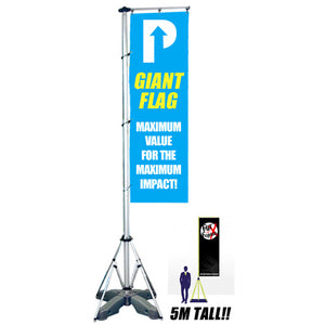
| Outdoor | Storefronts, buildings | 2-5 seconds | Large vinyl banners |
| Digital | Websites, social media | 1-3 seconds | Web banner ads |
2. Essential Design Structure
Every effective banner has three core elements:
1. Headline (Primary Message)
- Outdoor: 3-5 words max
- Indoor/Events: 6-10 words
- Digital: 8-12 words
Strong headline formulas:
- Direct benefit: "Save 40% This Weekend"
- Problem-solution: "Tired of Slow Delivery? Get Same-Day Service"
- Urgency: "Last 3 Days - Limited Stock"
- Social proof: "Join 50,000+ Happy Customers"
2. Supporting Text (Optional)
Keep minimal - one sentence or 2-3 bullet points:
- Expand on main benefit
- Add credibility (awards, certifications)
- Include key features
3. Call-to-Action (CTA)
Weak CTAs:
- "Click Here"
- "Learn More"
- "Visit Us"
Strong CTAs:
- "Visit Booth #347 for Free Demo"
- "Scan QR Code - Get 25% Discount"
- "Schedule Your Free Consultation"
- "Text SAVE to 12345"
3. Standard Banner Sizes
Physical Banners (Print)
Retractable/Roll-Up Stands:
- 33" × 79" - Standard (most popular)
- 39" × 79" - Medium
- 47" × 79" - Wide
- 59" × 79" - Extra Large
Tabletop Banners:
- 11.5" × 17" - Compact countertop size
Large Format:
- 3' × 6' - Standard event banner
- 4' × 8' - Large promotional display
- 8' × 10' - Photo backdrop
Browse all sizes at pullupstand.com.
Digital Banners (Web)
Most Effective Sizes:
- 300 × 250 px - Medium Rectangle (highest performance)
- 728 × 90 px - Leaderboard
- 320 × 50 px - Mobile Banner
- 1080 × 1080 px - Social media (Instagram/Facebook)
4. Typography Best Practices
Font Selection
Recommended: Sans-Serif Fonts
- Open Sans, Montserrat, Poppins, Roboto, Helvetica
- 40-60% more readable at distance
- Works for outdoor, indoor, and digital
Avoid:
- Thin/light fonts (300-400 weight) for distance viewing
- Decorative scripts for body text
- More than 2 font families per banner
Size Guidelines by Viewing Distance
| Distance | Minimum Font Size | Font Weight |
|---|---|---|
| 5 feet (tabletop) | 18-24pt | Medium (500+) |
| 10 feet (booth) | 36-48pt | Semi-Bold (600) |
| 20 feet (aisle) | 72-96pt | Bold (700) |
| 50+ feet (outdoor) | 180pt+ | Extra Bold (800+) |
For retractable banners viewed from 6-15 feet, use 48-72pt headlines minimum.
Typography Rules
- Maximum 2 fonts: One for headlines, one for body text
- Font weight: Use 600+ (semi-bold to bold) for readability
- Line height: 1.5× for body text, 1.2× for headlines
- Letter spacing: Increase slightly for large headlines
5. Color Strategy & Contrast
Color Psychology
| Color | Effect | Best For | Avoid For |
|---|---|---|---|
| Blue | Trust, stability | Healthcare, finance, tech | Urgent sales |
| Red | Urgency, excitement | Sales, food, promotions | Luxury brands |
| Green | Growth, eco-friendly | Wellness, organic, finance | Technology |
| Orange | Energy, action | CTAs, youth brands | Professional services |
| Black | Luxury, power | Premium products, fashion | Budget brands |
| Yellow | Attention, optimism | Clearance, creative | Large text areas |
Contrast Requirements
Minimum contrast ratios (text to background):
- Normal text: 4.5:1 minimum
- Large text (18pt+): 3:1 minimum
- Outdoor banners: 7:1 recommended
High-Performing Combinations:
- White background + Black text (21:1)
- Navy blue background + White text (15:1)
- Yellow background + Black text (19.6:1)
- Black background + White text (21:1)
Avoid:
- Light gray on white
- Pastel combinations
- Red text on black
Color Palette Strategy
60-30-10 Rule:
- 60% Background/dominant color
- 30% Secondary color (main elements)
- 10% Accent color (CTA, highlights)
6. Layout & Visual Hierarchy
The Z-Pattern Layout
Eyes naturally follow this pattern:
LOGO ────────────► TAGLINE
  │                   │
  │    MAIN IMAGE     │
  │                   │
  └─────► CTA BUTTON ◄┘
Placement Guide:
- Top left: Logo/brand
- Top right: Secondary message
- Center: Hero image/visual
- Bottom right: Call-to-action
White Space (Essential)
Don't fill every inch - white space:
- Increases comprehension by 40%
- Creates premium appearance
- Directs attention to key elements
Recommended allocation:
- Premium brands: 40-50% white space
- Professional services: 30-40%
- Retail/sales: 20-30%
- Events: 15-25%
Always maintain 10-15% margins from all edges.
Rule of Thirds
Divide banner into 3×3 grid. Place key elements at intersection points for natural visual balance.
7. Image & Visual Guidelines
Image Quality Standards
Print Resolution (DPI):
- Retractable banners (6-10 ft viewing): 150 DPI
- Large format (10-50 ft): 100-150 DPI
- Outdoor billboards (50+ ft): 72-100 DPI
Digital Resolution:
- Standard screens: 72-96 DPI
- Retina/high-DPI: 144-192 DPI
Visual Best Practices
Product Photography:
- Show product in use, not isolated
- Occupy 30-50% of visual space
- Include human element when relevant
- Use professional quality images
Background Strategy:
- Solid colors: Maximum readability
- Gradients: Modern but use sparingly
- Photos: Ensure product/text stands out clearly
For backdrop walls, use simpler backgrounds so people stand out in photos.
8. Technical Specifications
File Setup for Print
Required Elements:
- Bleed: 0.25" beyond finished size
- Safe zone: Keep text 0.5-1" inside edges
- Crop marks: Show where to trim
Example for 33" × 79" retractable banner:
- Design size: 33.5" × 79.5" (with bleed)
- Text safe zone: 32" × 78" (inside area)
Color Modes
CMYK (Print):
- Required for all physical banners
- Use profile: "US Web Coated (SWOP) v2"
- Always request color proof before production
RGB (Digital):
- Required for web/screen displays
- Never use RGB for print (colors shift 10-15% darker)
File Formats
For Print:
- PDF/X-4 - Industry standard (preferred)
- TIFF - High quality large format
- Resolution: 150 DPI minimum
- Fonts: Outlined/converted to paths
For Digital:
- PNG - Web banners with transparency
- JPG - Photos and email banners
- Resolution: 72-96 DPI
9. Common Mistakes & Fixes
| Mistake | Problem | Solution |
|---|---|---|
| Too much text | Information overload, unclear message | Max 3 key points, 10-word headlines |
| Poor typography | Hard to read, unprofessional | Sans-serif, 600+ weight, proper sizing |
| Low contrast | Text unreadable | Maintain 4.5:1 minimum ratio |
| No bleed/safe zones | Text cut off in printing | Add 0.25" bleed, 0.5" safe margins |
| Weak CTA | Low conversions | Specific action + benefit + urgency |
| Inconsistent branding | Dilutes recognition | Use exact brand colors, fonts, logos |
| Overcrowded layout | Visual overwhelm | 30-40% white space, clear hierarchy |
| Low image quality | Looks unprofessional | 150 DPI minimum for print |
10. Banner Types & Applications
Retractable Banner Stands
Best for: Trade shows, conferences, retail displays, portable presentations
Advantages:
- Setup in 30 seconds
- Portable with carrying case
- Reusable (swap graphics seasonally)
- Professional appearance
Popular options available at pullupstand.com:
- Standard retractable stands - Most versatile
- Tabletop retractable stands - Compact for counters
Design notes:
- Vertical/portrait orientation
- Safe zone at bottom (avoid mechanism)
- Optimized for 6-15 feet viewing
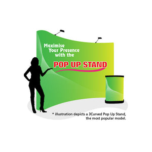
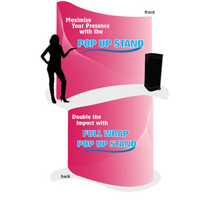
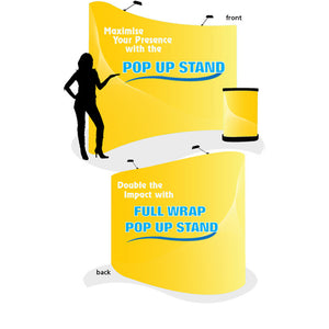
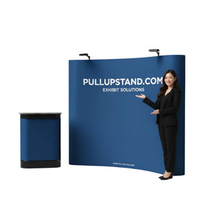
Backdrop Walls
Best for: Photo opportunities, conference stages, brand activation, press events
Advantages:
- Large visual impact (8-20 feet wide)
- Professional event environment
- Social media-friendly
- Modular/expandable
View all display options at pullupstand.com.
Design notes:
- Account for people in front (lower third)
- Social media safe zones
- High contrast for photos
11. Design Tools
Professional Software
- Adobe Illustrator/Photoshop - $55/month (industry standard)
- Affinity Designer - $70 one-time (budget alternative)
Beginner-Friendly
- Canva - Free/$13/month (easiest, templates included)
- Adobe Express - Free/$10/month (simplified Adobe)
Tip: Many pullupstand.com customers use provided templates, customizing with their brand elements.
12. Quick Execution Checklist
Pre-Design
- Define banner purpose and goal
- Identify target audience
- Determine dimensions (print/digital)
- Create headline and CTA copy
Design Phase
- Choose max 2 fonts (sans-serif preferred)
- Set 3-4 color palette
- Ensure 30-40% white space
- Verify 4.5:1 contrast minimum
- Add bleed and safe zones (print)
Technical
- Convert to CMYK for print, RGB for digital
- Export at correct DPI (150 for retractable banners)
- Outline fonts in final files
- Add crop marks for print
Testing
- View at actual distance
- Test contrast ratio
- Request color proof (print)
- Get feedback from target audience
Key Takeaways
- Simplicity wins - One focused message beats multiple competing ideas
- Typography matters most - Sans-serif, bold weights (600+), proper sizing
- Contrast is critical - Minimum 4.5:1 ratio, 7:1 for outdoor
- White space is power - 30-40% empty space improves comprehension 40%
- CTAs drive action - Specific + benefit + urgency = 45-91% lift
- Technical precision - CMYK for print, proper bleed/safe zones prevent costly mistakes
For professional banner displays, explore the full range at pullupstand.com including retractable stands, backdrop walls, and portable solutions for every marketing need.


